PETITES MATTES EDITORIAL BRIGHTS
- Regular price
-
$60.77 - Regular price
-
$60.77 - Sale price
-
$60.77
Couldn't load pickup availability
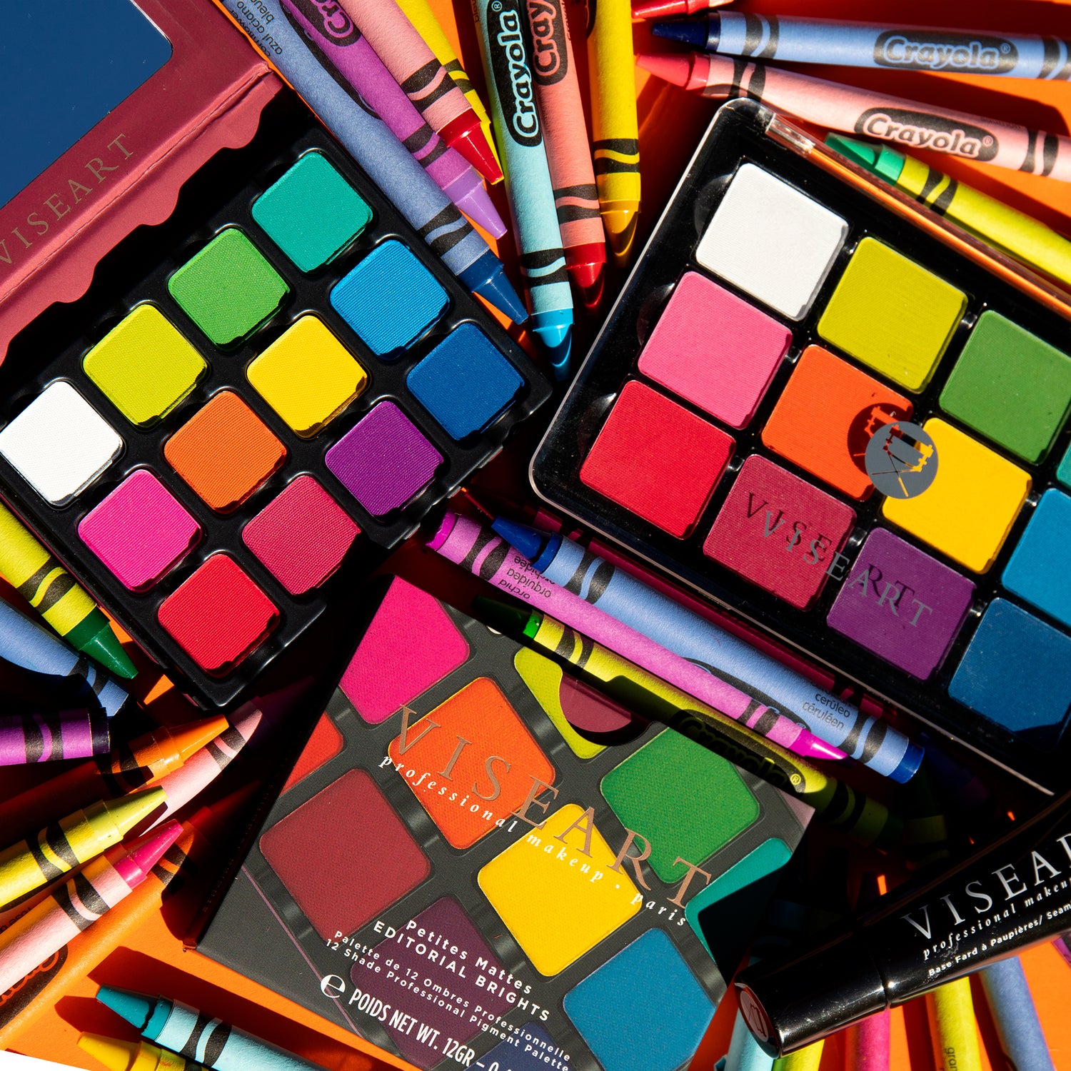
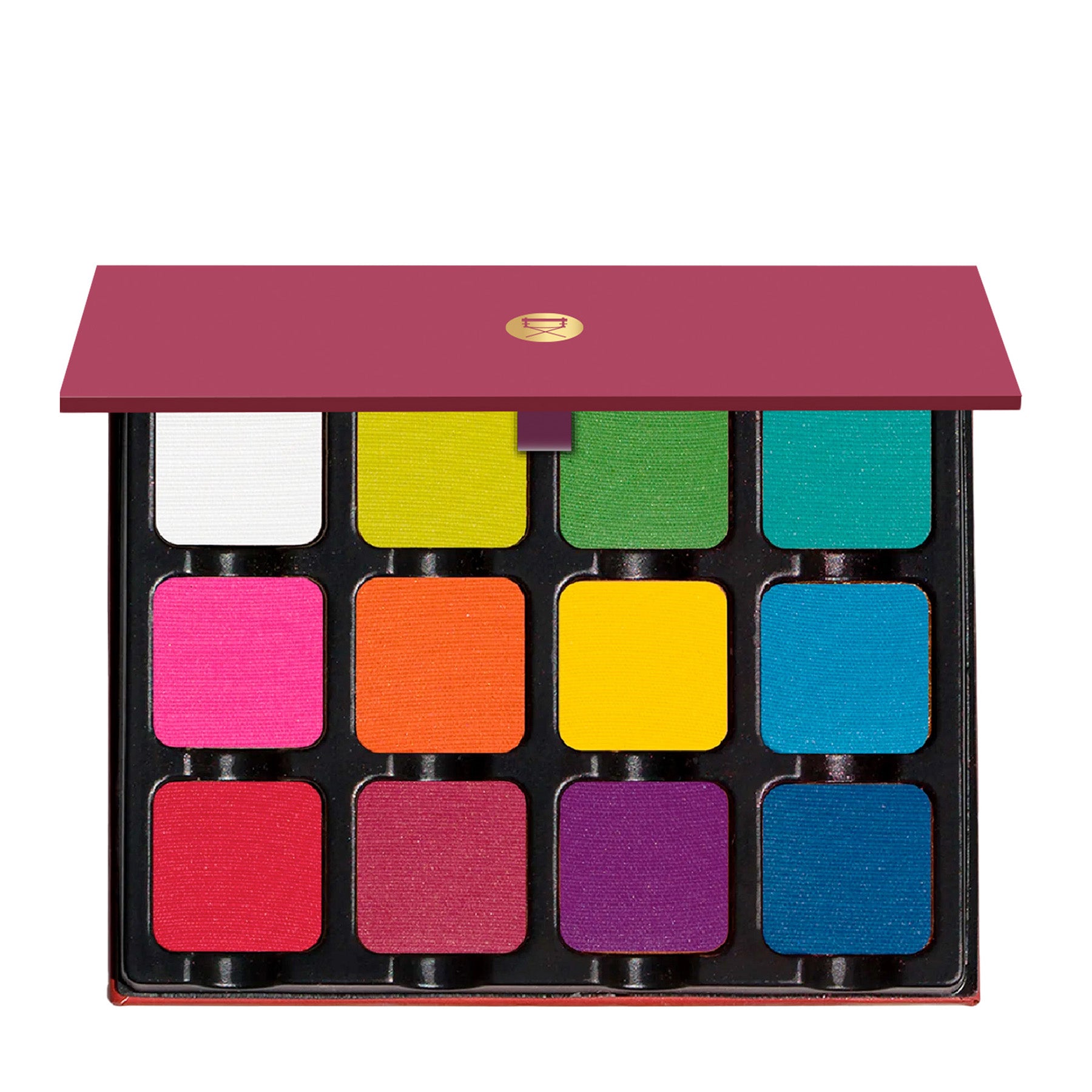
Come play in a world of endless color! These bold and bright hues are a playground for the imagination and the original, our much-coveted Editorial Brights Pro palette has been used on faces, bodies, and canvases the world over . The phenomenal formula of Viseart Paris mattes allows the shadows and pigments (see Shade Descriptors & Ingredients for use guidance) to be used as a mix in amplifying our other matte hues, it can be sheared out into a wash, pastelized by using the white shade in combination with any of the other shades to create a pastel hue, or liquefied for a bold, graphic look! Each shade works wonderfully in conjunction with our other products for a punch of pigmented color. If you live life in full colour, or are eager to learn and explore, then Petites Mattes Editorial Brights is a must-have in your kit!
Mix and match each magnetized pan throughout the Petites Mattes, Petit Pro & Edit collection, and curate your own personal dream palette!
76 GR, 92 mm x 75 mm x 13 mm
Shade Description
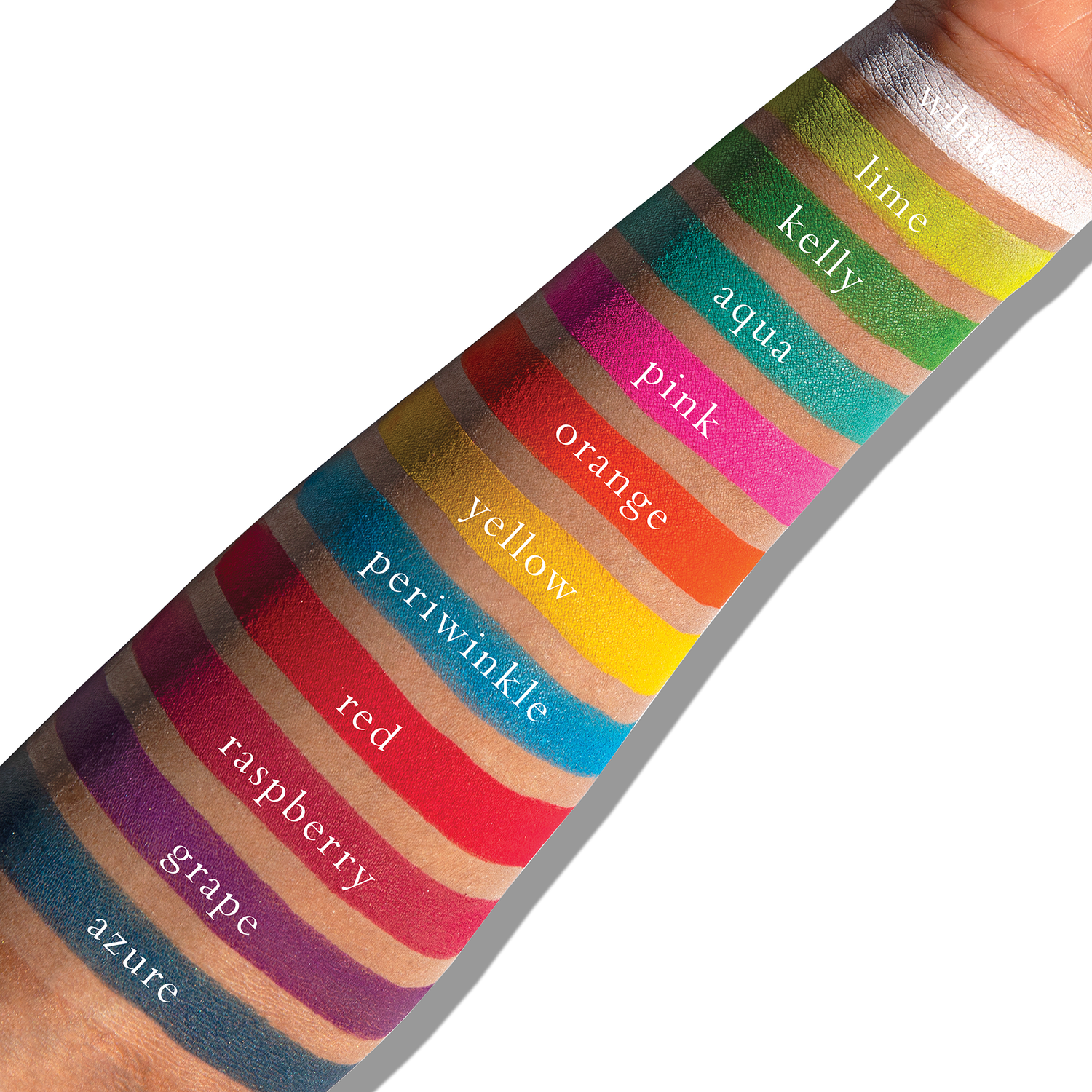
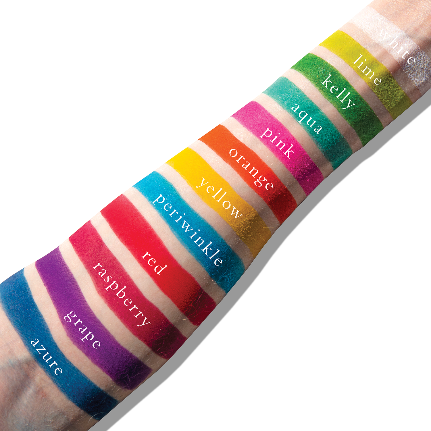
Shade 1: White — Bright white with a matte finish.
Use: The most versatile! This can be mixed with any of the other colors to make pastels, or blended in as a matte opaque color.
Shade 2: Lime — Neon yellow green with a matte finish.
Use: This is a tertiary color, as it’s a yellow-green, Mix with white to make pale lime, or with Clover to intensify the depth of the green. This color is also analogous to both blues and yellows.
Shade 3: Kelly — Bright green with a matte finish.
Use: This is a secondary color, mix with white to make pale green, with yellow to make a lighter green, or with blue to make Teal.
Shade 4: Aqua — Bright aqua with a matte finish.
Use: This is a tertiary color, it’s a blue-green. Mix with white to make anything from pastel teal to turquoise.
Shade 5: Pink — Bright fuchsia pink with a matte finish.
Use: A tertiary color, mix with white to make anything from pastel to bubble gum pink, or use to brighten up blue and green eyes. This can also be used on cheeks, or mix with a blush that’s too light to intensify it. *WARNING* - In the US, this shade contains pigments that the FDA has not approved for use in the eye area.
Shade 6: Orange — Primary orange with a matte finish.
Use: A secondary color, mix with white to make anything from a pale orange to pastel. Orange is amazing against blue eyes, or use analogous colors with it, like Red and Yellow. *WARNING* - In the US, this shade contains pigments that the FDA has not approved for use in the eye area.
Shade 7: Yellow — Primary yellow with a matte finish.
Use: Yellow is a primary color, which makes it ultra versatile. Mix with white to make anything from pastel to buttercup! You can also blend with orange to intensify the yellow, or blend with red to change the depth of the orange.
Shade 8: Periwinkle — Cyan blue with a matte finish.
Use: A tertiary color, Mix with white to range from pastel to sky blue, or use with analogous colors like purples or greens.
Shade 9: Red — Neon red with a matte finish.
Use: A primary color, Mix with white to make multiple shades of pink, or blend out to create purples, browns, oranges and more. *WARNING* - In the US, this shade contains pigments that the FDA has not approved for use in the eye area.
Shade 10: Raspberry — Bright raspberry with a matte finish.
Use: This is a tertiary color, it is a red-violet. It’s fantastic against brown or hazel eyes to brighten, but is a super versatile color with almost every eye shade. *WARNING* - In the US, this shade contains pigments that the FDA has not approved for use in the eye area.
Shade 11: Grape — Bright magenta purple with a matte finish.
Use: This secondary color can be made into pastel simply by mixing with white. This is also super versatile for every eye color to intensify. *WARNING* - In the US, this shade contains pigments that the FDA has not approved for use in the eye area.
Shade 12: Azure — Cerulean blue with a matte finish.
Use: This is a primary Blue, Mix with white to make a pastel blue, or use dramatically for anything you can think of. This can be used for liner, lid, crease - the sky's the limit. Blue is also a wonderful color to brighten Brown and Hazel eyes.
INGREDIENTS
Shade 1 (White): Talc, Mica, Octyldodecyl Stearoyl Stearate, Octyldodecanol, Zinc Stearate, Octyldodecanol, Potassium Sorbate, Sodium Benzoate. Shades 2 (Lime), 3 (Clover), 4 (Aqua), 5 (Pink), 6 (Orange), 7 (Yellow), 8 (Periwinkle), 9 (Red), 10 (Raspberry), 11 (Grape), 12 (Azure): Talc, Mica, Octyldodecyl Stearoyl Stearate, Zinc Stearate, Octyldodecanol, Potassium Sorbate, Sodium Benzoate. (+/- may contain: Yellow 5 CI 19140, Titanium Dioxide CI 77891, Blue 1 CI 42090, Red 28 Cl 45410, Red 6 Lake CI 15850, Red 7 Calcium Lake CI 15850, Ferric Ferrocyanide CI 77510, Red 40 CI 16035, Iron Oxides CI 77492/CI 77499). Vegan.
*WARNING* - In the US, shades 5, 6, 9, 10, 11 contain pigments that the FDA has not approved for use in the eye area.


PETITES MATTES EDITORIAL BRIGHTS
- Regular price
-
$60.77 - Regular price
-
$60.77 - Sale price
-
$60.77
its beautiful
Ideal for extravagant rainbow looks; or for adding a touch of vivid colour to liven up something more modest. The shades are good and blendable; the palette is nicely portable. And, happily, this one has a mirror!
Wonderful palette
Overall, i like this, but it doesnt live up to the hype for me. The colors are beautiful and vibrant and the pigment is pretty darn good, but the reds stain faintly, there is a lot of kickback, and they dont have a smooth texture. Theyre very powdery, and yes they are powder eyeshadows, but if you have tried blend bunny or similar brands, youll know what i mean. Some eyeshadows are what id call buttery, these arent. Texture varies from color to color though. Some are smoother than others. To be fair, these kinda of vibrant shades are hard to formulate. Still good, just keep that in mind.
Bought this set after trying to find out what the artist used for character makeup on a recent show. So happy they shared their secret and so, so happy I bought it. It's a perfect travel size in all the best ways and the pigment, quality and durability are absolutely top level. Recently wore this to a few concerts and even after staying on the floor all night my eyes looked like I had freshly painted them. Zero complaints, except that I didn't buy this sooner.


